How map illustration can engage visitors
A map is usually there to help us find our way. Where is the entrance? Where can I park? Which way are the gardens? Where are the toilets? Is there a café? How do I get from one part of the site to another?
For a large historic house or heritage site, there can be a lot of practical information that a visitor needs to take in. So it is very tempting to create a purely functional map and leave it at that. But I think there is an opportunity to do more. A map can be part of the visitor experience, not simply a tool for getting around. It can encourage people to look, notice things and become curious about the place they are visiting.
A historic house isn’t simply a collection of buildings, paths and facilities. It is a place with a history, a landscape, people, relationships and stories attached to it. A good illustrated map can start to communicate some of those things, rather than simply telling you where to go.
A map can tell more than one story
Smuggling stories into a map
I like the idea of smuggling stories into a map. It doesn’t necessarily mean filling it with blocks of historical information. In fact, I think some of the most effective details are the ones that you might not notice immediately.
Perhaps there is a bird flying across the map. Look a little closer and you realise it is a particular species that is closely associated with the venue, and perhaps one that visitors might spot during their visit.
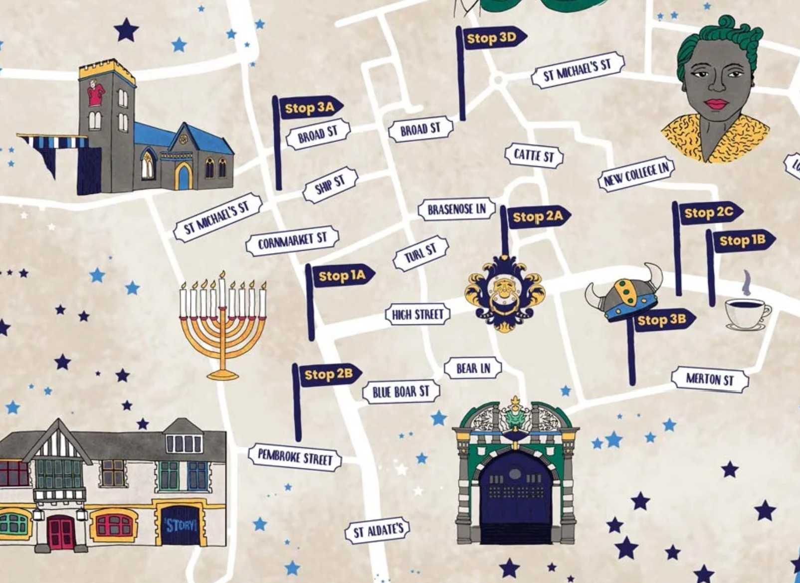
Perhaps there is a character doing something connected to the history of the place. Or a hidden object poking out from the greenery. Perhaps a historical object has been repurposed for something else, or appears in the background of part of the map. These details can simply give you something to discover.
I think that is one of the things that makes an illustrated map different from a purely functional one. It can reward you for looking, and in doing so, encourage you to engage more closely with the place.
The little things can be the most memorable
When I work on a map, I try to visit the site whenever I can. I want to look around, but I also want to talk to the person showing me around. I ask questions. I notice things. I try to soak up the atmosphere and collect all the information that might pique a visitor’s interest. Sometimes something very small catches my attention.
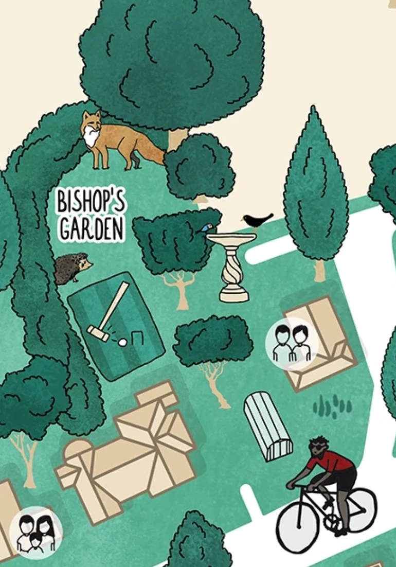
Once, while visiting a site, we saw a fox as we entered a particular section. My immediate thought was: that has to go in the map. And it did.
It wasn’t necessarily the most important fact about the site. But it was part of the experience of being there. It was something that could make the map feel connected to the actual place.
I think these details matter because a visitor’s experience of a historic house isn’t made up entirely of the official history. It is also made up of what they notice, what surprises them, what makes them smile and what makes them curious.
A map is more than a wayfinding tool
A map still has to work as a map
Having said all that, I don’t think an illustrated map should sacrifice its usefulness for the sake of storytelling. I like my maps to be geographically quite accurate. If someone is using the map to navigate around a site, it needs to work.
That accuracy gives me a framework to work within. Once I have that, I can add the details that capture the imagination and make the wayfinding more interesting.
There is a similar balance when it comes to historical accuracy.
I will research the stories I’m given and, where necessary, make educated guesses based on that research. But I am not a historian, and I don’t want to pretend that my interpretation is the definitive version of something when the evidence isn’t there.
So instead I talk to my clients. They have the expertise and the knowledge of the site, while I bring a different way of looking at the information. I might suggest something based on my research and ask whether I’m pushing the boundaries too far. This process tends to work really well. It means that the map can have some personality and imagination without losing the trust that is so important when you’re communicating heritage.
What does the place actually feel like?
One of the things I find particularly interesting about illustration is that it doesn’t just show us what something looks like. An illustrator looks at a place, an object or a person and interprets it. The finished work inevitably reflects the illustrator’s own way of seeing. That doesn’t mean imposing a personality onto a place. There still needs to be room for the viewer’s own experience.
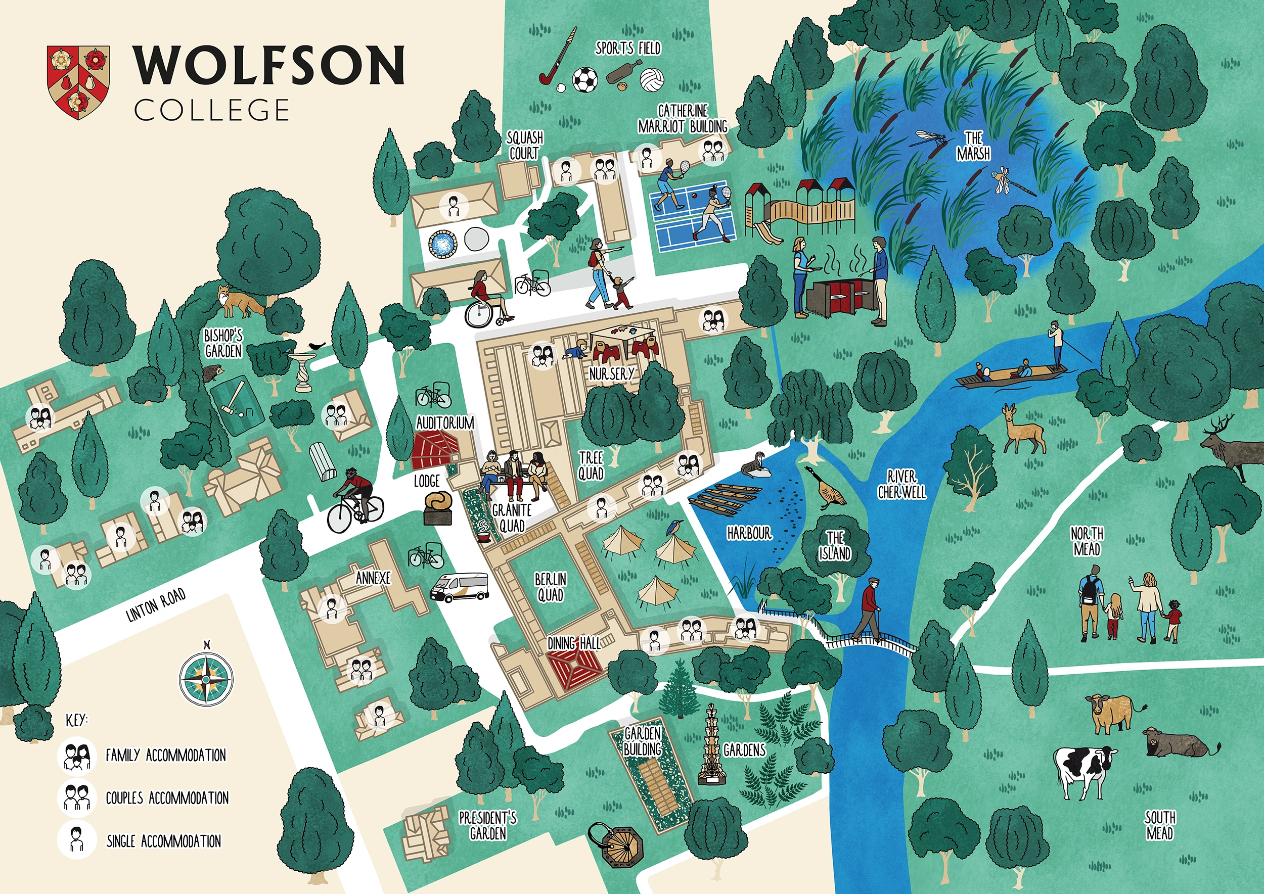
But illustration can communicate something about how a place feels. I saw this particularly clearly with the illustrated visitor map I created for Wolfson College, Oxford.
The buildings themselves aren’t necessarily the most obvious way of communicating what makes the college special. Instead, I wanted to bring in the people, the natural areas and the little narrative details (including a fox which I saw on my own visit) that help describe the atmosphere of the place.
Someone who had worked at Wolfson commented when I shared the map on LinkedIn:
“Having briefly worked at Wolfson, it may appear like an austere building but the sense of community, the people there and the wonderful natural areas make it so unique. It’s amazing how well this shows in your design!”
That was particularly lovely feedback to receive because it came from someone who already knew the place. They weren’t simply saying that they liked the illustration. They recognised something of their own experience of Wolfson in it. And I think that is a good test for any visitor map.
If the experience of being somewhere is completely disconnected from the experience of looking at its map, something has been lost.
A map can become part of the experience
Maps can start conversations
Of course, I can’t know exactly what every visitor does when they pick up one of my maps. I have never been the person who illustrated a place and then encountered that map as a first-time visitor. But I do think there is an opportunity for an illustrated map to start conversations.
A visitor might ask a member of staff about something they’ve noticed. They might recognise a connection between something on the map and something they encounter while walking around the site. They might answer their own question by looking more closely at the building or landscape. Or they might go home and Google something they saw on the map. The map doesn’t necessarily have to provide all the answers. Sometimes it just needs to make you curious enough to look for them.
And then there is the audience
The other thing that has to be considered is who is actually going to use the map. I often talk about how important the audience is for an illustration project.
A bespoke illustration is created for a particular audience, and a visitor map is no different. A historic house might have families, older visitors, tourists and people with a particular interest in the history of the place, all looking at the same map. You need to think about who you are communicating with and what they need from it.
That doesn’t necessarily mean creating a different map for every audience. But there may be times when it makes sense to have a more pared-back, practical map alongside a family-focused version. Museums are increasingly thinking about how they communicate with families differently, while still keeping within their overall visual identity.
For children, the communication might be simpler and the emotional side of the storytelling stronger. A question, a speech bubble, a big question mark or even a little light bulb can encourage them to look more closely and think about what they are seeing. But illustrating for children doesn’t mean making something childish. The map still needs to appeal to the adults who are likely to be holding it.
And sometimes the right answer isn’t an illustrated map at all. If a site is complicated, with lots of rooms, staircases, lifts or colour-coded routes, clarity may be more important than adding narrative detail. Map illustration is particularly interesting where there is a landscape, buildings, gardens or other elements that can be brought together to communicate something about the place.
I think the important thing is to start with the audience rather than assuming that one particular style of map will work for everyone.
What makes a successful visitor map?
The map is part of the experience
Perhaps this is why I think it is worth considering what a map is actually doing before deciding what it should look like. Is it simply a tool for navigation? Or can it also introduce people to the character of the place they are about to explore?
Can it tell them something about the people who lived there, the landscape they inhabited or the stories that have accumulated around it? Can it give them something to look for? Can it make them curious? And, perhaps most importantly, does it feel like the place?
I think a successful heritage map needs to do the practical things well. If navigation is one of its purposes, visitors need to be able to navigate.
But for me, there is something beyond that.
Capturing the essence
I want to capture the essence of a place through the lived experiences of the people who are there or who were there. That might be a fox appearing at just the right point on the map. It might be a historical character doing something unexpected. It might be a bird that you could actually spot during your visit, or a tiny reference that only makes sense once you’ve learned a little more about the site. Those details might not be the first thing you see. And perhaps that’s the point.
A good illustrated map can give you the information you need to find your way, while also giving you reasons to stop, look a little closer and start wondering about the place. And once you’ve started wondering, you’re already beginning to explore.
Talk to a Map illustrator about your project
I work with academic institutions, heritage sites, museums and nature reserves to create maps that engage visitors through weaving stories and capturing the atmosphere through illustration. If you have a project that you would like to discuss, feel free todrop me a line to start a conversation.