
Beyond wayfinding: capturing the mood of a place through map illustration
Illustrated visitor maps have a practical job to do. Where are the entrances? Which way are the gardens? Where can visitors park? How do they get from one part of the site to another?
Introduction
When commissioning a map for a historic house, museum or other visitor attraction, the first things to consider are usually practical. Where are the entrances? Which way are the gardens? Where can visitors park? How do they get from one part of the site to another?
These are all important questions, and a map needs to answer them clearly. But an illustrated visitor map can do more than show people where to go. It can also communicate something about the atmosphere of a place.
We expect a book cover to give us a sense of the book before we’ve read it. It might suggest a particular mood, hint at a story or give us an idea of the world we’re about to enter. I think an illustrated map can do something similar for a place, although this isn’t always something that map commissions explicitly ask for.
What makes illustrated visitor maps different?
A map is a representation of a place, but it doesn’t have to be a strictly literal one. Alongside the buildings, paths and facilities, there might be people, wildlife, historical characters or small details that tell us something about the place.
When I work on a map, I try to visit the site whenever possible. I want to look around and talk to the person showing me around. I ask about the people who visit, what they’re interested in and what makes the place distinctive. I’m interested in the atmosphere as much as the physical layout.
Sometimes a small detail catches my attention. On one site visit, we saw a fox as we entered a particular section of the grounds. My immediate thought was that it had to go in the map. And it did. It wasn’t necessarily the most important fact about the site, but it was part of the experience of being there. It was also something visitors might recognise if they happened to see a fox during their own visit.
Capturing the mood of a place
So how do we capture the mood of a place? This is where artistic licence comes in. Creating an illustrated map involves making choices about what to show, what to emphasise and how to bring different elements together.
I think about this in other types of illustration too. A book cover, for example, isn’t expected to depict every detail of a story. It needs to convey something about its atmosphere. With a map, the same thinking can be applied to a place.
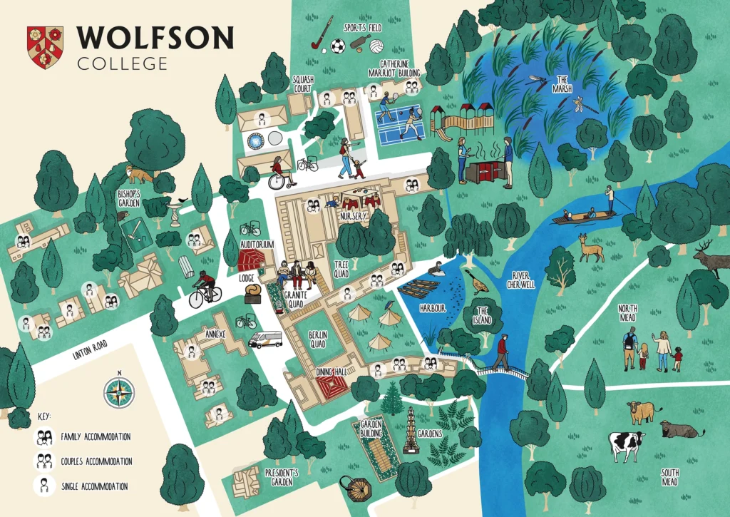
I saw this particularly clearly when creating the visitor map for Wolfson College in Oxford. The buildings alone weren’t necessarily the best way to communicate what makes the college distinctive and this is what their old map used to focus on. I wanted to include the community, the natural areas and some of the smaller details that contribute to its atmosphere, including a fox I had seen on my visit.
Someone who had briefly worked at Wolfson commented when I shared the map on LinkedIn:
Having briefly worked at Wolfson, it may appear like an austere building but the sense of community, the people there and the wonderful natural areas make it so unique. It’s amazing how well this shows in your design!
I was interested in this response because it picked up on aspects of the college that aren’t necessarily obvious from looking at its buildings. It also reinforced the importance of understanding how people experience a place, rather than relying solely on its physical appearance.
Getting the balance right
Of course, artistic interpretation doesn’t mean that accuracy can be overlooked. I like my maps to be geographically accurate, particularly when they’re being used for navigation. Visitors need to be able to find their way around.
There is a similar consideration with historical information. I research the stories I’m given and sometimes make educated guesses based on the available evidence. But I’m not a historian, so I discuss these with my clients, who have the specialist knowledge of the site. It’s important to know where the evidence ends and where interpretation begins.
The audience matters too. A map for families might include different details from one aimed primarily at visitors interested in the history or architecture of a place. That doesn’t necessarily mean making a separate map for every audience, but it does influence the choices made during the design.
And sometimes a straightforward functional map is exactly what’s needed. A complicated building with lots of rooms, staircases and lifts may need clarity above all else.
This is one of the things I enjoy about illustrated visitor maps: the opportunity to combine practical information with a sense of the place and the people who use it. The two don’t have to compete.

Planning an illustrated map?
I draw maps for heritage sites, museums, universities and nature reserves, to help people find their way and get a feel for the place.